Why Dopamine Colors Will Elevate Bedroom Atmospheres in 2026
Many individuals enter their bedrooms only to experience a subtle drain on vitality. Homeowners often prioritize furniture and linens while neglecting the profound influence of color on spatial perception. The emerging practice of dopamine decor addresses this oversight by employing hues that intentionally stimulate positive emotions, fostering environments that invigorate rather than diminish.
This shift moves beyond fleeting fads or garish applications. Designers emphasize purposeful color integration to alleviate stress and infuse spaces with renewed life. Bedrooms treated with such approaches become sanctuaries that support daily rhythms, from energizing awakenings to soothing conclusions.
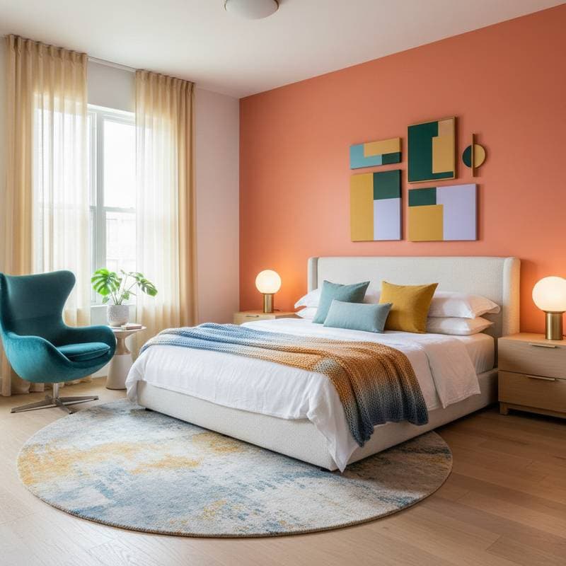
Neutral palettes like beige, gray, and stark white dominate many interiors for their perceived versatility. Yet these choices seldom evoke genuine warmth or engagement. As awareness grows, homeowners recognize the limitations of such restraint, turning to dopamine colors that interact with the brain's reward mechanisms for tangible mood benefits.
Understanding Dopamine Decor
The Essential Role of Mood-Enhancing Colors in Bedrooms
Bedrooms serve as primary arenas for mental restoration, influencing sleep patterns and emotional equilibrium more than any other domestic area. They frame the transition between rest and activity, making environmental cues pivotal to well-being. Drab, unvaried spaces contribute to lethargy in mornings and stagnation in evenings, undermining daily vitality.
In contrast, thoughtfully colored rooms establish affirmative foundations. Warm accents invigorate without overwhelming, while cool undertones promote repose. Such environments not only improve aesthetics but also enhance psychological health through subtle, daily reinforcements.
Repainting emerges as an accessible renovation, offering substantial returns with minimal investment compared to furnishings. This project demands preparation to maximize outcomes, ensuring colors perform as envisioned across varying conditions.
Preparation Essentials Before Painting
Assess lighting conditions first, as natural and artificial sources alter hue perceptions dramatically. A shade vibrant under retail fluorescents may appear muted or intense in home settings. Apply generous samples to walls and monitor them across morning, midday, and evening light, including fixture illumination.
Define the desired ambiance next. For tranquility, select warm neutrals accented by terracotta, mauve, or forest green. To cultivate dynamism, pair aquamarine, golden yellow, or magenta with gentle ivories or beiges. Equilibrium between bold elements and subdued bases prevents discord, yielding unified results.
Consider existing elements like flooring and textiles. These influence overall cohesion, guiding choices that complement rather than clash. This foundational step minimizes regrets and streamlines execution.
Essential Tools and Materials
Equip yourself adequately to streamline the process and achieve professional finishes. The following items prove indispensable:
- Painter's tape for precise edging
- Drop cloths to safeguard surfaces
- Angled brush for detailed trim work
- Roller with extension pole for efficient coverage
- Paint tray equipped with disposable liners
- Primer for transitions from bold to subtle tones
- Interior latex paint in satin or eggshell sheen, sufficient for two coats
Calculate needs based on wall area; a typical bedroom requires one gallon, but verify measurements. Satin finishes balance light reflection with durability, concealing minor flaws effectively.
Step-by-Step Painting Guide
-
Clear and clean the area. Relocate furniture from walls and wipe surfaces to remove dust or grime, promoting optimal adhesion.
-
Apply tape meticulously. Secure edges around moldings, outlets, and ceilings for sharp delineations that elevate the final appearance.
-
Apply primer as required. Use it when shifting from deep shades to lighter ones, reducing the number of topcoats needed.
-
Edge with precision. Employ the angled brush to coat perimeters, ceilings, and fixtures, establishing clean boundaries.
-
Roll evenly across walls. Work in vertical, overlapping passes with steady pressure; opt for multiple light layers over a single thick application for superior smoothness.
-
Allow full curing. Permit 24 hours or more for drying before repositioning items, as hues stabilize during this phase.
Follow these sequentially to ensure efficiency and quality, transforming preparation into polished execution.
Addressing Frequent Painting Challenges
Overambition with intensity represents a common pitfall; an entire room in vivid tangerine may overwhelm despite initial appeal. Initiate modestly with feature walls or integrate via fabrics, artwork, or upholstery to gauge lived experience.
Ill-suited lighting exacerbates issues, where harsh LEDs distort warm palettes into unnatural casts. Select warm-toned bulbs to preserve authenticity. Incorporate varied textures, blending sheens for dimension that counters potential monotony in lively hues.
Scale applications to room size; expansive areas benefit from moderated saturation to maintain openness. These adjustments refine outcomes, aligning vision with reality.
Indicators for Professional Assistance
Complex surfaces like stippled textures, vaulted ceilings, or integrated cabinetry warrant expert intervention. Professionals ensure flawless blending of hues and sheens, avoiding amateur inconsistencies.
Tackle challenges such as adhesive residue from wallpapers, surface patching, or HVAC integrations through specialists. Investing in skilled labor averts prolonged efforts and expenses, delivering superior, enduring results.
Advanced Strategies for Optimal Results
Establish a primary hue supported by two complementary shades to maintain focus and avoid clutter. Position dominant colors strategically, such as behind bedframes, to anchor attention without domination.
Pair vibrant selections with organic textures like timber accents, cotton weaves, or woven fibers to ground the palette. Preserve ceiling neutrality to foster spaciousness and prevent constriction.
Periodically evaluate the scheme; introduce fresh linens or accents to sustain vibrancy as preferences evolve. These tactics sustain long-term satisfaction and adaptability.
Realizing Lasting Benefits in Your Bedroom
Implementing dopamine decor yields immediate and sustained enhancements to daily life. Bedrooms evolve from neutral backdrops into personalized retreats that nurture mood and functionality. Homeowners report heightened motivation and serenity, underscoring the power of intentional design.
This approach proves versatile across styles, from minimalist to eclectic, ensuring broad applicability. By prioritizing emotional resonance, spaces become extensions of well-being, inviting restful nights and inspired days. Commit to these principles for a transformative upgrade that endures.