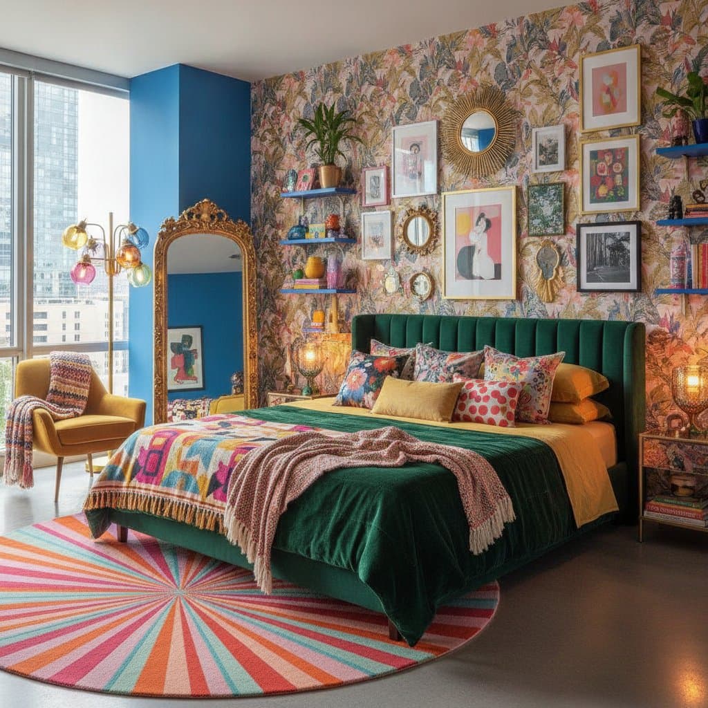
Color Blocking Transforms Bedrooms Into Personal Retreats
A bedroom can feel calm without becoming bland. Color blocking brings confident, playful color into the room through clear shapes, painted sections, layered textiles, and thoughtful contrast. The result feels personal, uplifting, and easy to adjust when your taste changes.
Why Color Blocking Works in a Bedroom
Color blocking means placing two or more solid colors together in deliberate areas. Instead of spreading one shade across every surface, you give each color a job. One might frame the bed, another might define the ceiling, and a third could appear through bedding or art.
This approach suits bedrooms because it lets you control energy. Bright shades can bring optimism, while dusty or muted tones keep the room restful. You do not need a dramatic mural or a full renovation. A painted rectangle behind the headboard, a colorful quilt, or a pair of contrasting lamps can create the same visual lift.
Start With a Mood, Not a Paint Card
Color blocking becomes easier when you decide how you want the bedroom to feel. Joyful does not have to mean loud. It might mean fresh, sunny, collected, romantic, or playful.
Try building a small mood list:
- Fresh: butter yellow, leafy green, warm white
- Playful: coral, lavender, cobalt blue
- Soft and lively: peach, rose, cream
- Grounded and cheerful: tomato red, olive, tan
- Clear and energetic: turquoise, navy, pale pink
Choose one dominant color, one supporting color, and one small accent. The dominant color can cover a wall or appear in a large rug. The supporting color can define the bed wall or bedding. Use the accent in smaller details, such as a vase, cushion, lampshade, or framed print.
A simple ratio helps prevent visual overload. Let the main shade cover roughly half the visible color, the second shade take about one third, and the accent fill the remaining portion. You can break this rule when your room calls for more drama, but it offers a reliable starting point.
Frame the Bed With a Painted Block
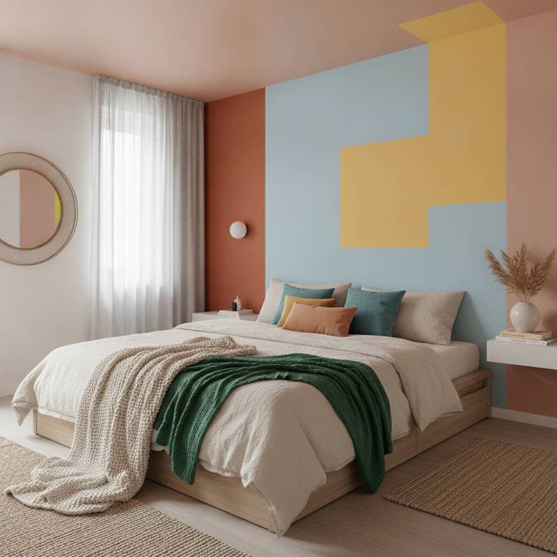
The wall behind the bed is the natural place to begin. A color block can create the feeling of a headboard without adding furniture, and it gives the entire room a clear focal point.
Paint a wide rectangle that extends beyond both sides of the bed. For a queen size bed, a block around 90 to 100 inches wide often feels balanced, though your wall and nightstands matter more than an exact measurement. Let the color rise above the headboard or pillows by at least 18 inches so the shape remains visible when the bed is made.
You can also paint a tall arch, a wide horizontal band, or two vertical panels. Use painter's tape for crisp edges, and press the tape down firmly before applying paint. Remove it while the final coat still feels slightly soft for a cleaner line.
If you rent, create the same effect with a large fabric panel, a folded quilt hung from a curtain rod, or removable wallpaper. A colorful screen behind the bed works well too, especially in a studio or shared space.
Let the Ceiling Join the Conversation
A colorful ceiling can make a bedroom feel finished and unexpectedly joyful. It also gives you a chance to use a strong shade without covering every wall.
Choose a ceiling color that appears somewhere else in the room. A pale blue ceiling can echo a blue throw, while a warm apricot ceiling can connect with a rug or artwork. Keep the walls lighter if the ceiling is saturated. This preserves airiness and keeps the color block from feeling heavy.
For a more graphic look, carry the ceiling color down one wall by several inches. This creates a painted border that feels intentional and architectural. Use a level and mark the height lightly in pencil before taping. Uneven lines stand out, especially near corners.
Small bedrooms benefit from this technique when the ceiling height feels generous. If your room has a low ceiling, choose a light, warm tone and keep the border narrow.
Mix Unexpected Color Pairs
Joyful bedrooms often rely on combinations that feel a little surprising. Look past standard pairs such as blue and white, and try colors with different levels of warmth.
Pink and red can feel sophisticated when you choose a muted blush with a clear cherry accent. Green and lilac bring a garden quality to the room, especially when paired with natural wood. Orange and powder blue create lively contrast, while yellow and burgundy feel rich and cozy.
The trick is to repeat each shade at least twice. If cobalt appears only in one picture frame, it can look accidental. Repeat it in a cushion, book spine, ceramic lamp, or small section of the rug. Repetition helps bold color feel collected rather than scattered.
Pay attention to undertones. A yellow with a green undertone may clash with a pink that has a blue undertone. Hold fabric and paint samples together in natural light, then check them again under your bedroom lamps.
Use Bedding as a Flexible Color Block
Bedding offers the easiest way to experiment. It changes quickly, requires no paint, and lets you adjust the room when you want a different mood.
Start with one large color field, such as a duvet cover or quilt. Add a contrasting folded blanket across the lower third of the bed. Then place pillows in two or three related colors rather than buying a complete matching set.
Try these combinations:
- Rust quilt, pale pink blanket, cream sheets
- Cobalt duvet, saffron lumbar cushion, soft green pillow
- Lavender coverlet, tomato red throw, warm white linen
- Leafy green quilt, peach cushions, tan woven bench
Keep at least one textile quiet. If every layer has a strong pattern or intense shade, the bed can become visually tiring. Solid fabrics with different textures offer plenty of interest. Look for washed linen, cotton matelassé, velvet, or chunky woven materials.
A colorful bed skirt, floor cushion, or upholstered headboard can extend the blocking without requiring another painted surface.
Balance Bold Color With Restful Materials
Color needs texture to feel inviting. Smooth painted walls look more comfortable beside woven baskets, nubby rugs, timber furniture, or rumpled bedding.
Designer and stylist Emily Henderson frequently recommends mixing polished and relaxed elements so rooms do not feel overly designed. Apply that idea by pairing a crisp geometric color block with an imperfect material. A sharp blue wall can sit beside a woven pendant. A bright coral stripe can meet a vintage wood nightstand.
Natural materials also soften high-energy combinations. Add a rattan basket for spare blankets, a wool rug beside the bed, or linen curtains in a gentle neutral. These pieces help the eye rest between stronger areas of color.
You do not need to replace your existing furniture. Work with what you own first. Warm wood, black metal, white laminate, and painted furniture can all support a color-blocked scheme when the palette repeats thoughtfully.
Keep Lighting From Flattening the Palette
Bedroom lighting changes color more than many people expect. Cool bulbs can make warm paint look dull, while very warm bulbs can turn pale colors muddy.
Use layered lighting to preserve the mood. Place reading lamps on both sides of the bed if possible, then add a small ambient lamp on a dresser or shelf. A ceiling fixture can provide general light, but it should not be the only source.
Choose bulbs that make fabric and paint look natural. Test them before deciding whether a color feels wrong. If your bedroom receives limited daylight, favor colors with warmth and clarity, such as peach, butter yellow, warm pink, or soft green.
Mirrors can help distribute daylight, but place them where they reflect light rather than glare directly into the bed. A framed mirror also offers another opportunity to repeat an accent color.
Make Small Color Blocks Count
You can create a joyful bedroom without painting at all. Small, intentional blocks work especially well in rentals, guest rooms, and spaces with expensive wallpaper.
Try a colorful curtain on one side of the room, a painted bedside table, or a pair of contrasting lamps. Arrange books by color on a short shelf, or place a bright rug beneath the lower half of the bed. Artwork with large areas of solid color can serve as a portable focal point.
Thrift stores are excellent sources for these accents. Look for ceramic vessels, framed textiles, vintage quilts, painted stools, and unusual lamps. Inspect wiring, check that furniture feels sturdy, and clean every secondhand piece before bringing it into the bedroom.
Live With the Palette Before You Commit
Test your color choices in the actual space before making permanent decisions. Live with samples for several days, observing how morning light, evening shadows, and artificial lighting affect each hue. Move swatches around the room and note which combinations feel most comfortable over time. This patient approach prevents costly mistakes and ensures your final palette truly supports rest and daily joy.