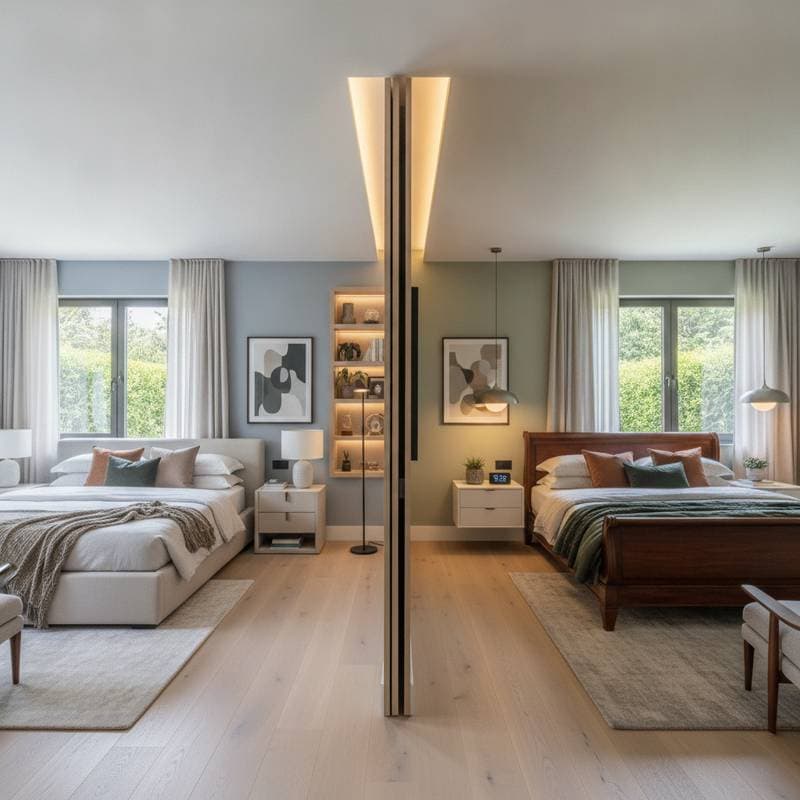
Key Points
- Bold color choices lift mood and energy levels by stimulating dopamine production and fostering excitement alongside comfort.
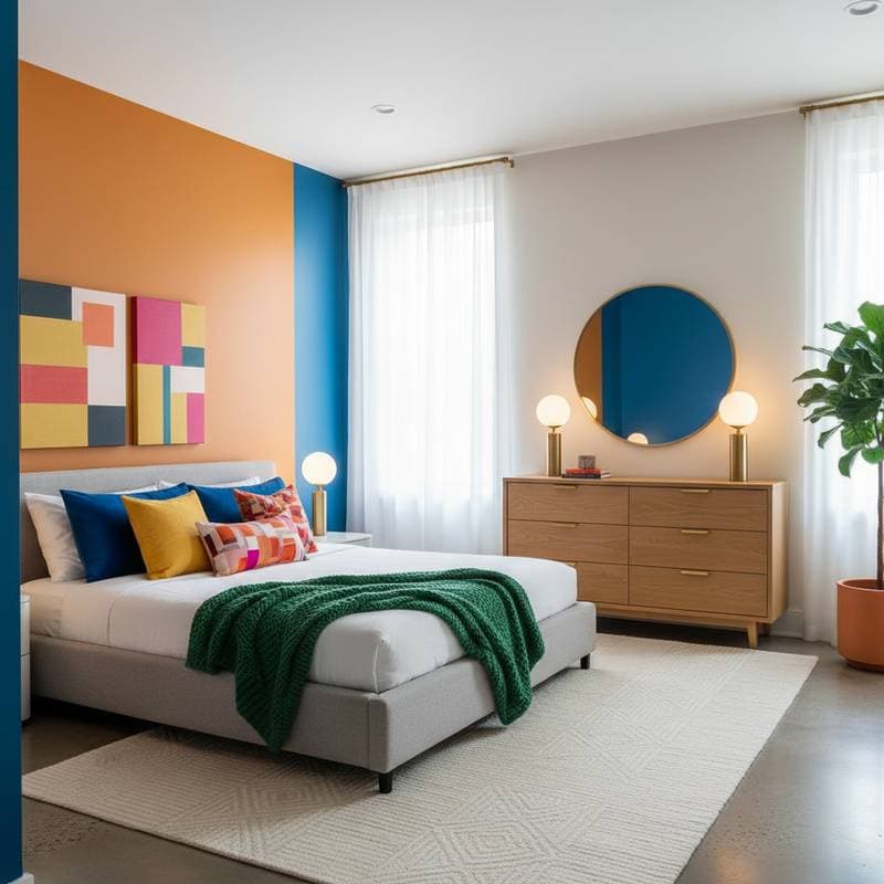
- Warm, saturated hues like coral, mustard, emerald, or cobalt transform a bedroom into a rejuvenating personal retreat.
- Balanced design planning makes vibrant colors feel intentional rather than overwhelming, using proportion, texture, and lighting control.
- Careful preparation and testing achieve the desired emotional response while ensuring long-term satisfaction with the color environment.
Understanding Color Psychology and Dopamine Decor
Color psychology examines how hues influence mood, focus, and emotional regulation. In interior design, these principles shape how individuals experience their surroundings. Dopamine decor involves selections that activate brain reward pathways via sensory elements, especially color, texture, and light. Bold bedroom colors fulfill this role by introducing emotional contrast, visual interest, and opportunities for personal expression.
Assessing Your Space
Before incorporating bold colors, evaluate the room's conditions and your personal comfort levels. Follow these steps to build a solid foundation:
- Light exposure: Track sunlight patterns throughout the day. South-facing rooms accommodate deeper or cooler tones effectively, whereas dim areas thrive with lighter, warmer shades.
- Room size and height: Saturated colors visually contract space, ideal for creating coziness in larger bedrooms but potentially restrictive in small ones without ample light.
- Existing materials: Consider how flooring, fabrics, and furniture interact with new colors. Wood tones soften blues or greens, while gray surfaces sharpen reds.
- Personal response: Test sample swatches and note your emotional reactions. One person's energizing hue might overwhelm another.
Record these insights to inform your palette decisions. This systematic evaluation prevents expensive errors and aligns the space with your aesthetic and emotional objectives.
Planning the Project
Essential Tools and Materials
Gather these items for a smooth process:
- Paint rollers, angled brushes, and painter's tape.
- Drop cloths and sanding blocks.
- Primer matched to the current wall surface.
- Selected paint colors in finishes like matte, eggshell, or satin.
- Sample boards or large poster boards for trials.
- Varied lighting sources, including daylight and warm bulbs, for assessments.
Safety Measures and Surface Preparation
Ensure proper ventilation during painting to avoid fumes. Protect eyes with eyewear during sanding and use gloves for paints or solvents. Cover floors, remove outlet plates, and repair wall flaws before priming. Thorough preparation guarantees even application and true color representation.
Timeline and Workflow
Allocate two to three days for preparation, testing, and painting. Permit drying time between coats and review progress in natural and artificial light. Tackle one wall or section at a time to preserve overall balance.
Implementing the Design
Step 1: Identify Focal Areas
Choose elements that draw the eye first. An accent wall behind the headboard suits powerful shades like emerald or deep plum. For immersion, apply bold tones to the ceiling, producing a enveloping warmth that enhances comfort.
Step 2: Choose Complementary Neutrals
Neutrals counteract potential overstimulation. Pair coral or mustard with soft ivory or taupe. Align cobalt blue or teal with cool gray or crisp white. Aim for a 60 percent neutral, 30 percent bold color, and 10 percent accent distribution to secure equilibrium.
Step 3: Conduct Thorough Testing
Apply generous swatches across several walls. View them at various times under daylight and lamps. This step confirms the hues deliver the anticipated mood without surprises.
Step 4: Execute Precise Painting
Prime every surface, followed by two coats of finish paint with uniform strokes. Preserve a wet edge to eliminate streaks. In multi-color schemes, dry sections completely before masking neighbors. Track completed areas with a checklist for uniformity.
Step 5: Layer Textures and Finishes
Incorporate materials to modulate bold colors. Soft bedding, woven throws, or matte elements soften intense pigments. Glossy surfaces amplify vibrancy, whereas matte ones add depth and serenity. Select according to the emotional impact you seek.
Ensuring Quality Results
Inspect for even coverage, steady tones, and no brush marks. View the room from a distance to confirm harmony. Address these checkpoints:
- Does the palette stimulate without disrupting rest?
- Are shifts from bold to neutral seamless and purposeful?
- Does lighting sustain the effect across daily cycles?
Should imbalances arise, tweak bulb temperatures or add neutral items like pale bedding or rugs to restore equilibrium.
Sustaining the Vibrancy
Bold colors sustain their mood-boosting effects through diligent care. Wipe walls gently with a soft cloth and mild detergent to avoid fading. Repair scuffs quickly to uphold intensity. Observe seasonal light shifts, as varying illumination can modify hue perception.
Expert Strategies for Optimal Outcomes
- Begin modestly: Test saturation on a headboard, dresser, or chair if full walls intimidate.
- Manage illumination: Add dimmable lights to shift from energizing to soothing as needed.
- Apply color principles deliberately: Reds and oranges invigorate, blues and greens soothe, yellows uplift. Blend for harmony.
- Incorporate personal significance: Select shades tied to joyful memories to amplify dopamine effects.
- Archive details: Note paint formulas for easy future matches or expansions.
Embracing the Transformed Space
After completion, allow adjustment time. The mind processes color through instant reactions and gradual familiarity. Residents often report heightened creativity and upbeat starts to the day. If intensity persists in spots, introduce textiles or natural accents like wood and linen to refine the atmosphere.