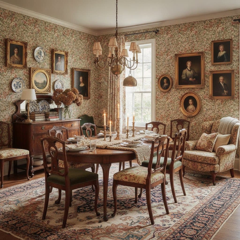
Infuse Joy into Your Dining Room with Bold, Vibrant Colors
Dining rooms often serve as overlooked spaces rather than vibrant centers for shared meals and lasting memories. Homeowners frequently opt for beige walls and neutral palettes out of concern for errors. Professionals in home remodeling recognize that a single color decision can define the success of an entire area. Dining rooms deserve liveliness and warmth that mirror personal style rather than caution. Bold colors, applied thoughtfully, introduce joy, comfort, and dynamism to this essential part of the home.
Reasons Dining Rooms Often Lack Appeal
Neutral tones dominate because individuals select colors designed to avoid controversy. The intention to maintain simplicity results in spaces that appear devoid of vitality. Color influences lighting, furniture, and surface treatments to establish mood. Without vibrant elements, even high-quality pieces seem lackluster.
The Influence of Bold Colors on Atmosphere
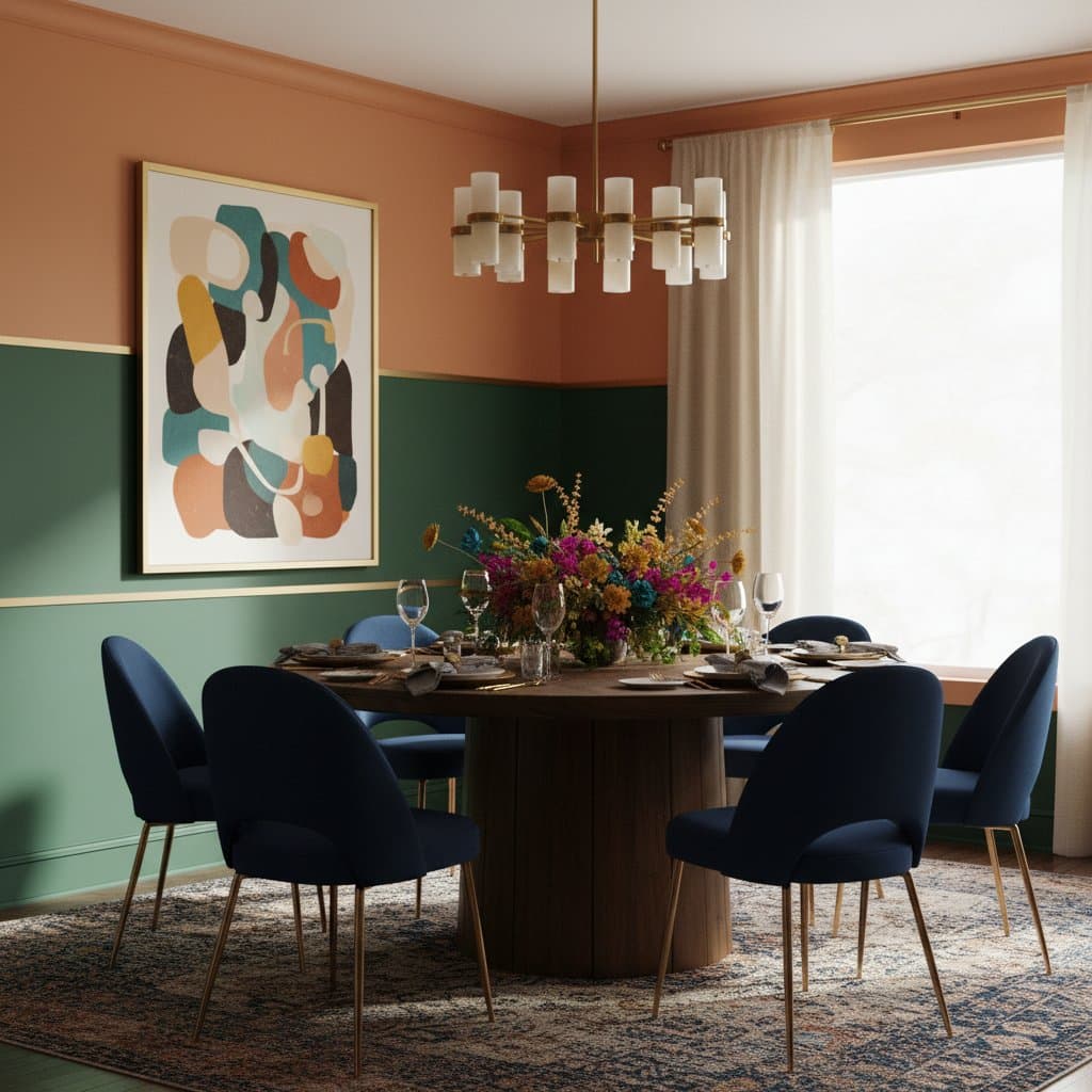
Bold colors evoke specific emotions rather than mere visual impact. Deep teal conveys serenity paired with assurance. Rich mustard yellow evokes coziness and reminiscence. Shades like coral or emerald achieve elegance through careful integration. Intentional application ensures these colors enhance rather than dominate.
Homeowners commonly err by overwhelming spaces with clashing tones or diluting impact with overly subdued choices. Harmony among walls, furnishings, illumination, and accents forms the foundation. View color as the underlying rhythm that unifies the dining room composition.
Essential Preparation Steps Before Applying Bold Colors
Commit to foundational preparations to integrate bold colors effectively in dining spaces.
- Assess natural illumination. Spaces with ample windows accommodate deeper shades, as sunlight prevents a sense of heaviness.
- Examine current surfaces. Materials such as flooring, trim, and furniture dictate compatible tones; a cherry wood table suits warmer palettes than a sleek glass counterpart.
- Apply test swatches. Colors shift from store samples to actual walls; observe swatches over several days under varying light conditions.
- Select appropriate finishes. Matte options conceal minor flaws, satin provides gentle sheen, and semi-gloss maximizes light reflection; align choices with desired aesthetics and longevity.
These measures minimize errors and build assurance in final selections.
Proven Bold Color Strategies for Dining Rooms
Practical, tested approaches reliably convert dining areas into engaging environments.
Deep Navy or Midnight Blue
This tone delivers refined depth. It harmonizes with crisp white trim, brass hardware, and wooden details. Navy generates compelling contrast without excess intensity. In compact rooms, lighter ceilings and moldings maintain equilibrium against the shade's richness.
Vibrant Emerald Green
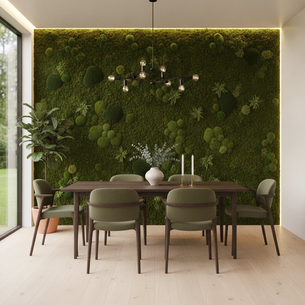
Emerald infuses vitality and renewal. It complements organic elements like rattan weaving, oak grains, or linen fabrics. As a bridging hue in open-plan layouts connecting to kitchens or living zones, emerald blends natural boldness seamlessly.
Warm Terracotta or Burnt Orange
Earthy tones such as these promote relaxation and culinary inspiration. They evoke terracotta pottery, aromatic spices, and homemade dishes. Terracotta surfaces align well with matte black fixtures, textured weaves, and sturdy wooden tables for grounded appeal.
Bold Mustard Yellow
Mustard yellow radiates optimism while remaining anchored. It adapts to both antique and contemporary designs. Applications succeed alongside oak flooring and pale trim, providing subtle character without overwhelming brightness.
Rich Plum or Aubergine
Deep purples cultivate closeness ideal for intimate evenings or illuminated meals. These shades flourish with ambient warm lighting. Neutral surroundings allow the color to emerge prominently without rivalry.
Achieving Balance in Bold Color Applications
Vibrant hues require restraint to avoid disarray. Professional balance elevates designs to refined levels.
- Restrict to three core colors. Designate one primary, one supporting, and one neutral for cohesion.
- Incorporate varied textures. Elements like braided rugs, fabric drapes, and timber pieces temper bold surfaces.
- Integrate white or natural wood elements. These provide visual respite and avert saturation.
- Adjust lighting strategically. Warm sources amplify reds, oranges, and yellows; cooler tones suit blues and greens.
Such techniques render bold schemes purposeful and enduring.
Pitfalls to Sidestep in Bold Color Projects
Experienced remodelers identify patterns in common oversights.
- Overlooking ceiling treatments. Stark white ceilings can isolate bold walls; opt for a diluted wall shade to unify the space.
- Neglecting primer application. Intense reds and yellows demand quality base layers to reveal accurate pigmentation.
- Excessive accessorizing. Striking walls command attention; select minimalist art and items to complement.
- Disregarding upkeep needs. Darker finishes reveal marks readily; choose durable, cleanable variants for active households.
Steering clear preserves the freshness of bold dining rooms over time.
Scenarios Requiring Professional Assistance
While painting appears straightforward, bold colors expose surface imperfections acutely. Address cracks, moisture damage, or irregular textures through expert repairs prior to coloring. Intricate features like wainscoting or ornate trim benefit from skilled precision in edges and cuts. Professionals equip themselves for flawless execution, allowing homeowners to focus on final customizations atop a primed foundation.
Realizing the Full Impact of Bold Colors
Boldly colored dining rooms alter not just appearances but emotional responses during gatherings. Meals gain intimacy, discussions extend naturally, and the area pulses with life. Personal preferences guide choices over fleeting trends or idealized images.
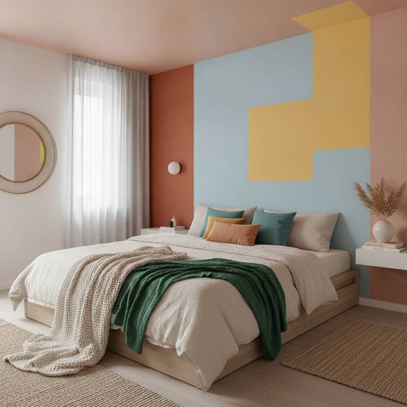
For those approaching change cautiously, initiate with targeted applications. An accent wall behind the table or a refinished cabinet in a striking shade offers initial transformation. Witnessing these shifts builds momentum for broader commitments, unlocking the space's potential.
Sustaining Daily Harmony with Bold Hues
Bold colors endure when integrated thoughtfully into routines. Regular maintenance, such as gentle cleaning and periodic accent refreshes, keeps vibrancy alive. Over time, these spaces evolve into cherished backdrops for countless shared moments, affirming the value of intentional design.