Bold Colors: Dopamine Decor for Restful Sleep
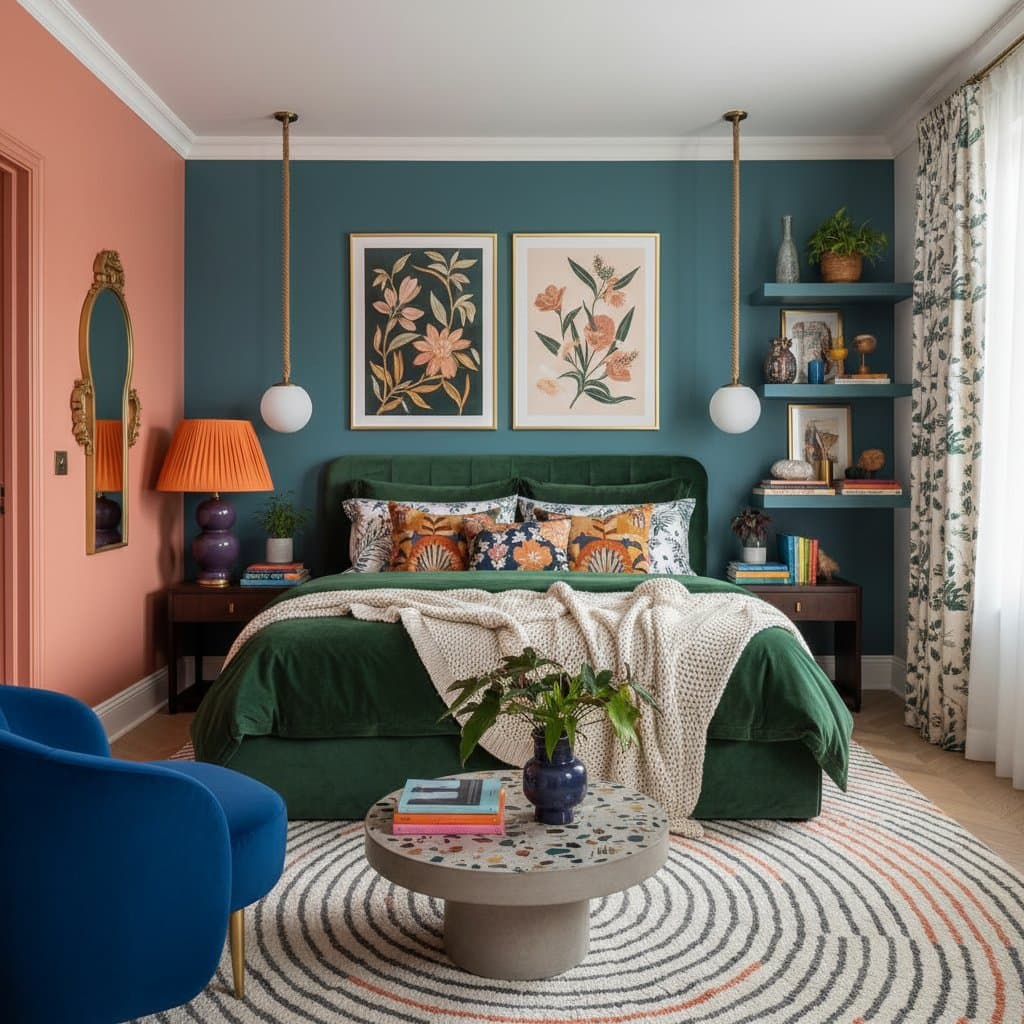
I remember the first time I painted a bedroom wall deep teal in our London flat. My husband thought it would feel too heavy, but once the furniture was back in place and the lamps were switched on, the room wrapped us in calm energy. It was bold, but somehow soothing. Since then, I’ve become fascinated by how color affects our mood and sleep, especially as dopamine decor has taken over social feeds and real homes alike.
Key Takeaways
- Dopamine decor celebrates color that sparks joy and emotional balance.
- Bold hues can still promote rest when chosen intentionally.
- Layered color use through textiles, lighting, and art creates depth without overwhelming.
- Cultural influences shape how we perceive comfort and relaxation through color.
The Appeal of Dopamine Decor
How Color Influences Sleep
According to interior designer Amara Lewis, color psychology is key to creating a restful dopamine-inspired space. “Your brain responds to color before you even process what you’re looking at,” she said. “If you choose shades that make you happy but also relaxed, your body follows.”
Warm tones like burnt orange or blush pink create a cocoon effect, while cooler hues such as deep blue or sage invite serenity. The trick is to temper intensity. A cobalt wall might feel energizing in the morning, but at night it needs balance through soft lighting and tactile fabrics.
Combining Energy and Calm
One of the best ways to embrace dopamine decor for better sleep is to mix bold colors with restful textures. In our Cotswolds home, my children’s rooms are full of saturated shades, but I use linen bedding, wool throws, and matte paint finishes to soften the atmosphere.
Try these combinations:
- Emerald green walls with natural jute rugs and cream bedding.
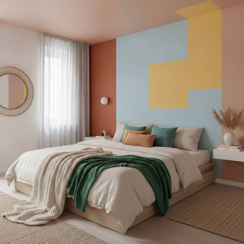
- Coral accents through artwork paired with muted sand walls.
- Navy and mustard layered with oak furniture and warm lighting.
Each pairing keeps visual interest high without overstimulating the senses.
Global Lessons on Color and Rest
After living in different countries, I’ve noticed that cultural color traditions influence how people sleep and unwind. In France, bedrooms often use muted yellows and soft blues reminiscent of sunlight and sea. In England, I’ve seen a love for deep greens that echo the countryside, bringing the outside in. In American farmhouses, faded reds and worn whites create nostalgic warmth that feels instantly homey.
You can borrow from these ideas by choosing one color story inspired by a place you love. Maybe it’s the lavender fields of Provence or the indigo markets of Marrakech. Let that sensory memory guide how you decorate.
Making It Work for Real Life
A dopamine-filled bedroom still needs to function for family routines, quick cleanups, and changing tastes. Choose washable fabrics and easy-to-repaint finishes. Keep the base neutral if you’re hesitant, then layer color through accessories that can evolve with the seasons.
Lighting matters as much as the palette. A bold wall under harsh white bulbs feels garish, but under soft amber light it becomes calming. If you share your space, compromise on intensity. A happy medium like muted terracotta or dusky lavender brings warmth without overwhelming.
Living with Your Color Choices
Once your dopamine-inspired bedroom is complete, give yourself time to adjust. The first few nights might feel different, especially if you’ve moved from a minimalist palette to something richer. Notice how your body responds. Do you feel more relaxed, energized, or balanced? The beauty of decorating this way is that it’s personal.
Color should feel like a reflection of your best moments, not a strict design rule. Whether you dream in deep teal, soft coral, or golden ochre, let your bedroom remind you that boldness can be restful too. When chosen with care and emotion, even the most vivid shades can invite deep, restorative sleep.